Twelve selected, twelve different values
Every product I have used lies about bulk edit. I built the state model before any screen existed, generated six interface directions against it, and scored them on a rubric written before I knew which would win. The component runs on this page.
Select twelve servers, change one setting. But the twelve do not currently agree with each other — some are production, some staging, some development. What should the field show?
I have only ever seen two answers to that. A blank box, which says no value and is false. Or the first item’s value, which is worse, because it looks like data. Either way you can overwrite eleven things you never looked at.
This is the case study for fixing that. The model is built and tested, and the component runs just below this — including the case that took longest to answer honestly, several operations at once, where the true answer turns out to be “this is the same as…” rather than “these conflict”.
Before any concept existed I wrote down the seven things this had to get right. Not requirements — the specific ways bulk edit goes wrong. They were the input to the rubric, so they could not be adjusted afterwards to match what got built.
| Hard case | What it demands | Where it is met |
|---|---|---|
| Mixed values | The field must never show a value the selected items do not share. | Groups by transition. There is no single-value field to lie with. |
| Method per field type | The legal verbs change with the kind of field. | methodsFor(field) — a boolean is never offered a toggle. |
| No-op honesty | An operation that changes nothing has to say so. | “28 will not change”, never folded into the updated count. |
| Per-item preview | You can see what happens to each item, not only the total. | Expand any group: before → after, per host. |
| Partial failure | Some succeed, some fail, and the retry must know which. | reconcile(). The retry touches only what failed. |
| Scope honesty | “60 on this page” and “1,847 matching” cannot be the same click. | The selection bar states both. Deselect one and it says so. |
| Keyboard | A tool run fifty times a day cannot be mouse-only. | Esc backs out of every state except a commit in flight. |
All seven are met, and every one of them is checkable in the component below rather than on my word. Four of the seven were unaddressed by all six concept directions when they were first scored — which is what a rubric is for, and is recorded in concept-scoring.md →
Try Log retention → Decrease by → 7 and open the clamped at 1 group. Or Tags → Clear all → Apply, which is the one operation that asks you to type the word.
Contents · 12 sections · ~19 min
- 00The hard part, written down first
- 01Two of the three things a field can do are lies
- 02Why a form cannot do this
- 03It works — and it is deliberately ugly
- 04I built the model before the screens
- 05Choosing without taste
- 06Three evaluations, and what they disagreed about
- 07Flat scores, opposite meanings
- 08The winner had a hole, and the fix collapsed the tie
- 09What building it caught
- 10Eight directions, and mine came fourth
- 11What the four checks found
A form has one field and one value. The whole premise of bulk edit is that the values differ — so that field has three things it can do, and two of them are lies.
Watch what a blank field does. You select twelve hosts to add a tag. The Environment field is blank because the twelve disagree, so you leave it alone — and on save, eleven hosts get set to whatever the form submitted. You did not touch that field. You never saw the eleven values you destroyed.
Showing the first item’s value instead is the more common fix and the more dangerous one, because a populated field reads as fact. Nothing on screen says this is one of twelve answers.
A blank lies quietly. The first value lies convincingly.
The third option is the honest one, and it is the reason this is a design problem rather than a wording problem: show the word Mixed. That is not a lie. The values do differ, and it says so. It is just nearly useless. Eleven production hosts and one staging reads as Mixed. Four each across three environments reads as Mixed. You are about to overwrite both, and the word tells you neither which one you are looking at nor how much of it you are about to change.
The reasonable objection at this point is that this is a lot of thought for a bulk edit. It is worth answering, because it is the reason the bad version keeps getting shipped: this is the one screen where a mistake is multiplied. A form that misbehaves damages one record and you find out. This one damages every selected record at once, and the damage is usually invisible afterwards — nothing looks broken, there is just a value somewhere that used to be different. It survives because it looks simple.
The available verbs change with the kind of field. That is why bulk edit cannot be a form with a Save button.
| Field | What it holds | What you can legally do |
|---|---|---|
| Environment | One value per host | Set — nothing else is meaningful |
| Tags | A list per host | Add, Remove, Replace, Clear |
| Monitoring | On or off | Enable or Disable — never toggle |
| Log retention | A number, 1–365 days | Set, Increase by, Decrease by |
Toggle is the interesting one. A switch on mixed state has no defined meaning. Half are on, half are off — toggle them to what? Every one I have used ships a toggle here, which means it has already decided the answer, and none of them says which.
Relative numbers are the other one. “Decrease retention by 14 days” moves each host from its own current value, not from a shared one, and clamps at the field’s floor. A host already at the minimum does not change at all. The operation succeeds and does nothing, and the interface has to say so.
The component above is the real thing, running. Change the field, expand a group, tick a host to exclude it, and watch every count move at once.
It computes nothing. Every count, group, diff and legal-verb list on it comes from model.js. If a number here is wrong, the model is wrong — there is no second place for it to go wrong.
Why publish it looking like this
Because the visual layer is the next stage, and if you only ever see the finished thing you cannot tell what it contributed. Craft that works is invisible — the whole point of it is that nothing draws attention to itself. Showing the wireframe now means the visual version can be set beside it later, and the difference between them is the argument rather than a claim about it.
It also keeps me honest. The rest of this page is reasoning. This is the part that either behaves or does not, in your browser, right now.
The design of this thing is the state model. You cannot mock your way to it, because the interesting behaviour is arithmetic, not layout.
So the first artifact was not a frame. It was a pure function that takes the selected items, a field, a method and an operand, and returns what would happen to each item — before and after, and whether anything actually changed. Thirty tests, all passing, no interface.
→ 11 will change · 1 already matches
That second number is the whole point. A normal product reports “12 updated” for that operation. It reports “12 updated” for every operation, including the ones that did nothing. Once the model can tell the difference, every interface built on it can be honest for free — and, as it turned out, every one of them was.
Six credible options is a worse position than two. With two you can argue. With six you pick the prettiest and construct the reason afterwards.
I did not draw the six. I gave a Figma agent the state model — field types, legal methods, no-op rules — and asked for six distinct directions against it. What is mine is the model underneath, the rubric that follows, and the judgement about which one is right.
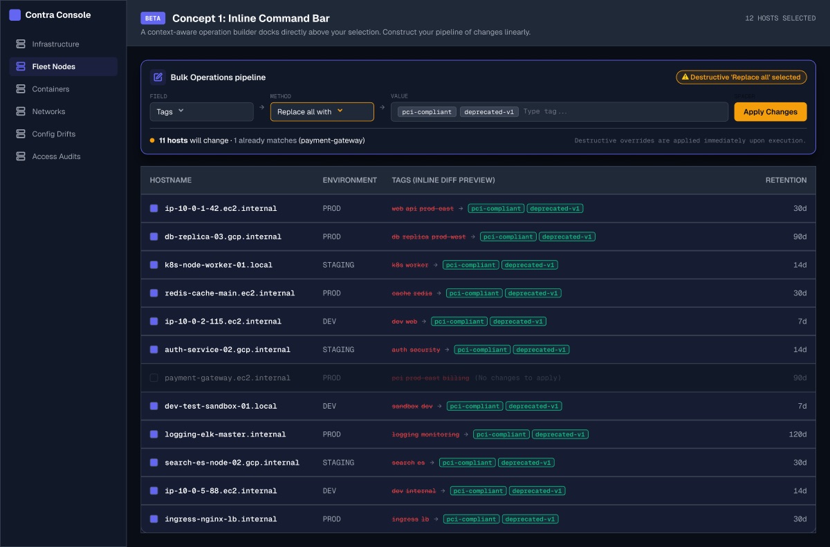
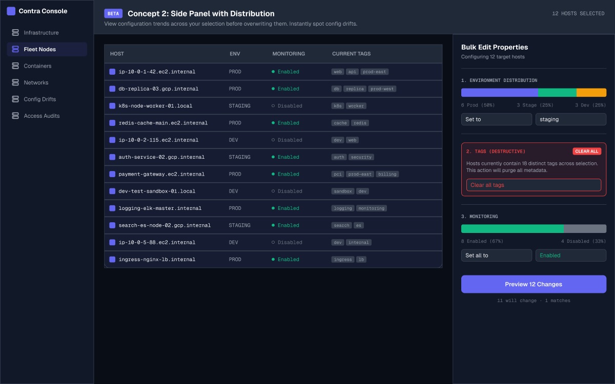
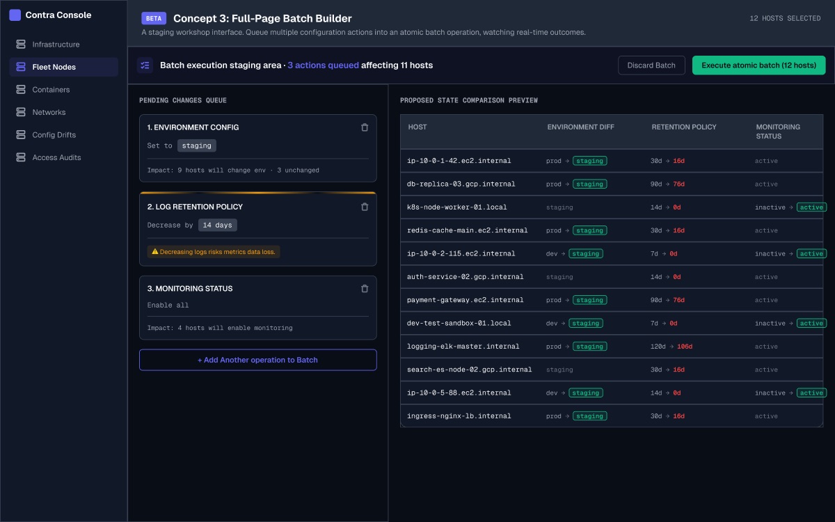
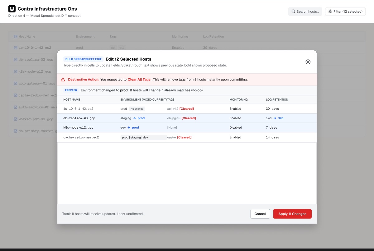
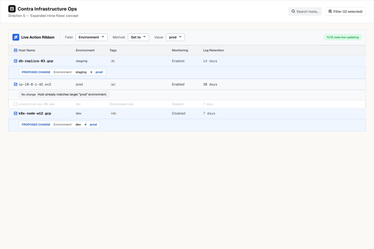
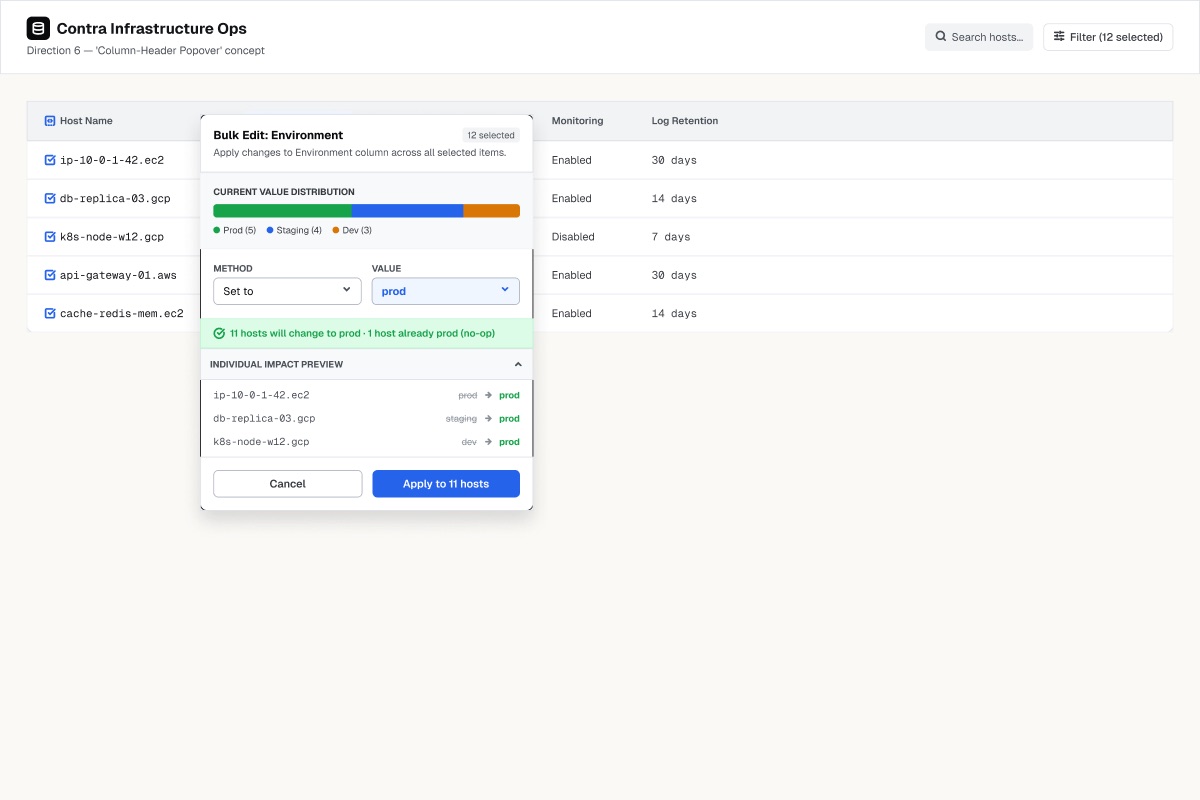
All six are plausible. That is the problem.
What I left out of the rubric
Sixteen criteria, drawn from Nielsen Norman’s heuristics, the seven hard cases above, and the fact that it has to ship as a web component. The useful part is the exclusions. Three of Nielsen’s ten were dropped because they could not discriminate between six concepts that share a vocabulary, and one — aesthetic and minimalist design — was kept but rewritten, because scored directly it is taste. It became two falsifiable questions: does it hold at 1,000 rows, and does a screenshot explain itself. The decision table, heuristic by heuristic, is in why-these-criteria.md →
Four more things were deliberately not measured: visual polish (four of six were rendered by the same agent in one pass, so render quality is noise), novelty, accessibility beyond keyboard (identical work for all six, so it cannot discriminate), and click count as a headline number.
The fewest-clicks option here is also one of the least honest. Optimising clicks on a destructive, multiplied, irreversible operation is optimising the wrong thing.
Honesty and error prevention carry three times the weight of everything else, because a dishonest interface that is faster is not better, it is worse — it accelerates a wrong action across every selected item at once.
The scores
| Category | 1inline bar | 2side panel | 3batch builder | 4modal | 5inline rows | 6popover |
|---|---|---|---|---|---|---|
| Honesty ×3 | 18 | 18 | 18 | 21 | 21 | 21 |
| Error prevention ×3 | 18 | 12 | 24 | 18 | 9 | 12 |
| Cognitive load ×2 | 18 | 16 | 14 | 10 | 14 | 14 |
| Efficiency ×2 | 10 | 12 | 10 | 8 | 10 | 10 |
| Craft fitness ×2 | 16 | 16 | 12 | 10 | 12 | 16 |
| Total of 117 | 80 | 74 | 78 | 67 | 66 | 73 |
Two criteria did the separating. Locality — how far the control sits from the data it changes: direction 1 renders the diff in the real row, so there is no moment where you are reviewing a representation of your change rather than the change; direction 4 puts the data behind the thing editing it, greyed out and unreadable. And legibility at scale — does it hold at 1,000 rows, not 12.
Correction. Direction 1 does not deserve a 3 here, and I only saw why when I started planning the build. Its layout survives 200 rows; its review does not. Six screens of scrolling is not verification, and large selections are exactly where a mistake costs most — so the quality that won this direction degrades precisely when it matters. I had scored “the layout does not break” and written it down as “this still works”. It is a 2, and the gap it opens is addressed below.
Direction 1 wins at 80, direction 3 is second at 78, and that gap sits inside the noise of my own judgement. It is explained entirely by two weighting choices: putting multi-operation composition inside efficiency at ×2 rather than giving it its own ×3, and counting implementation cost at all. Move multi-op to its own category and direction 3 wins.
The rubric did not choose the winner. The weights did — and the weights are an argument about what the tool is for.
One disclosure, because it matters: I had recommended combining directions 1 and 2 before building the rubric, and the rubric then ranked them first and third.
I ran a second evaluator — a reusable one I had published to my design team — over the same six. It ranked the modal spreadsheet first. My rubric had put it fifth of six. The cause was one line in the evaluator’s own decision record:
“I scored what I could verify in the design, not what the brief promises.”
The evaluator, explaining its own scoring ruleMine did the opposite — it credited a shape for what it could naturally hold, whether or not the frame showed it. On the specific point it was right and I was careless: the modal drew the best destructive warning in the set, naming the action, the host count and the irreversibility, and I had noted only that a banner existed.
But the two rules answer different questions. Which of these should we ship? scores what is demonstrated. Which of these should we develop? scores what the structure can hold. These were round-one concepts generated to be developed — and neither evaluation had been told which question it was answering. Each silently picked, and the pick decided the winner.
They did not disagree about the designs. They disagreed about what counts as evidence — and nobody had asked.
So I fixed the instrument rather than the answer: state the question up front, score every option twice and publish where the two passes disagree, generate criteria for capabilities no option has, and enforce the close-call gate that already existed on paper. The re-run inverted the ranking and converged with my rubric. That is evidence, not proof — both could still share a blind spot neither has been asked about.
Two criteria scored identically across all six: every concept made current state visible, and every one was framework-independent. A criterion that never separates anything is not a criterion, it is a precondition. Those should have been an entry filter.
Three others were also nearly flat, and they mean the reverse. Scope honesty, partial failure and keyboard operation scored 1 or 0 almost everywhere. Same statistical signature — a column of matching numbers — and the opposite conclusion.
Flat because everyone passes is a wasted criterion. Flat because everyone fails is the most valuable thing the rubric produced.
Six independently generated directions all missed the same three things. None handles select-all beyond the current page — the difference between “12 selected” and “1,847 matching your filter” is the difference between a routine edit and an incident. None shows partial failure: nine of twelve succeeded, and there is nowhere for the three to go. None shows a keyboard path, for a tool someone runs fifty times a day.
Those three gaps became the build list. All three are in the component above — scope beyond the current page, partial failure with a retry scoped to what failed, and Esc to back out of any state except a commit in flight. The keyboard path was the last one, and it only got built because an end-to-end review caught this sentence claiming it already had been.
Planning the build surfaced a problem no evaluation had caught: the inline diff is only reviewable while the selection is small.
Twelve hosts is twelve rows and one screen. Two hundred hosts is six screens of scrolling, and scrolling is not review. Every evaluation had treated per-row diffs as scale-proof because the layout holds at any row count — but the operator’s ability to actually check the thing does not, and bulk edit’s whole reason for existing is the case where you cannot check by hand.
The quality that won this direction degrades exactly where the stakes are highest.
The answer is that at scale nobody reviews rows. They review classes of change.
Three lines instead of two hundred, each expandable to its members. This holds at any size because the number of distinct transitions is bounded by the field’s cardinality, not by the selection. A field with three possible values produces at most three groups whether you selected twelve hosts or twelve thousand. Multi-value fields behave the same way: will gain the tag and already has it.
Relative numeric operations are the exception, because every item moves from its own value. Those group by outcome class instead — decreased by fourteen, clamped at the minimum, already at the minimum and therefore unchanged. Which is also the only way the clamping behaviour becomes visible at all: at row 147 of a flat list, nobody would ever find it.
It also dissolved the decision I thought I was making
The two finalists were separated by 1.2% and looked like a trade: per-item impact against aggregate distribution, one or the other. Grouping shows they are the same object seen at two moments. The distribution is the state before the operation; the grouped diff is the state after. summarise() produces the groups, plan() fills in what happens inside each one — both already exist in the model, and neither was written with this in mind.
So the distribution bar is not a consolation prize grafted onto the winner. At scale it becomes the index into the diff.
What this cost: a scoring error that survived my own rubric, a full evaluation, and a corrected re-run of that evaluation — three passes, none of which asked what happens at two hundred rows. It was caught by trying to build the thing. That is not an argument against evaluating; it is a reminder of what evaluation cannot reach.
The interface is built. Four treatments went into the evaluation and it declined to name a winner: three of them finished within 2.2% of each other, and the fourth — the one I had ranked first — came last. So the tie was mine to break, and it broke on a single line of the reasoning: a dead operation you must click a tab to discover is one you will not discover. That is why it is one lane per operation, all of them on screen, and no tabs.
What exists. A field-type model with fifty-three passing tests, published at github.com/omkarpkh/bulk-edit-mixed, and a working component built on it — running in section 03. All seven hard cases behave, including the two that took longest. Scope honesty: the moment “60 on this page” becomes “all 1,847 matching this filter”, the header checkbox still means exactly one thing, and deselecting one host from an all-matching selection says so rather than letting the number quietly slide. And several operations at once, where the honest answer turned out to be this is the same as… and never these conflict: nothing is blocked, no ordering is chosen for anyone, and a superseded operation reads as “changes nothing — Set Log retention to 1d undoes it”.
Plus a pass on what gets expensive to retrofit once there is a visual layer. Focus used to be destroyed on every render, which made the whole thing mouse-only in practice; group headers were divs, so the central interaction could not be reached by keyboard at all; sixty-one of sixty-seven focusable elements had no accessible name. All fixed, and the counts that move when you exclude a host are now announced rather than changing in silence.
And building it caught three things that three evaluations did not. The batch has to become the truth the moment one operation is banked, not at two — gated at two, a single banked operation was still being previewed by the emptied picker, and the button offered to change every host instead of the 193 that would. The button, the summary line and the lane list all have to read from the same place; two of the three were still reading the single-operation plan. And a new piece of state has to be added in two places, because the reset path rebuilds the whole object — added in one, it threw on the first click.
None of those are model bugs. The model needed no change and no test moved. They are all the same fault: two parts of an interface disagreeing about what is true — which is precisely what this component exists to stop happening between a field and its value.
What is still not there. It runs on this page, not inside a product. No operator has used it under time pressure, which is the only test that finds what a wireframe cannot. The visual layer is a theme toggle rather than a designed thing. And nobody has yet misread it in front of me, which is the evidence I would most like to have and do not.
The visual round. Three directions of mine, five from a Figma agent, against one specimen — the same 200 hosts, the same clamp. All five agents chose an ordinal ramp for an ordered scale, which made my Instrument, with its five unrelated hues, the outlier. It was wrong. So was the component: it had been drawing that distribution bar in six unrelated hues the whole time, and stayed that way through my first pass at building the winner — a polish theme that changed corner radius while the losing direction’s colour logic ran underneath. All five also marked when the system had intervened on a clamp. I had managed that in one of three.
Contrast was a hard gate, not a scored criterion: a direction whose stated mechanism fails its own measurement is making a false claim, not an incomplete one. The gate eliminated all eight. So it could not select, and became a better question — is the failure in the palette, or in the mechanism? Only Grid’s was in the mechanism: its amber row exists to make the row glow, and measures 1.04:1.
Flow won at 74.7%, and building it showed the round’s limits. Its arrow was scored on one specimen — a numeric decrease, with a clamp, three groups. Three things about the real component were not in that frame. A clamp needs a numeric field and a relative method, so it is reachable in one of five common operations and impossible on tags, booleans and selects. Real group sets are often two rows, where reading two numbers beats comparing two arrow lengths. And every row opens with a disclosure caret the static frames did not have, so the arrow landed ten pixels from it — a control glyph beside a data glyph, both pointing.
So the mark appears only where there is something to mark: on the clamped row, after the label — beside the thing it qualifies rather than the thing you click. What survives is what a number cannot do live: drag the operand from 7d to 14d and the clamp swells from 44 hosts to 82 while the distribution above it holds still, because it did not change. Four operations in five get the width back.
The row that says nothing will happen used to be grey on grey at 3.40:1. It is now body ink at 16.67:1. That was not a darker grey: the grey was repeating what the missing arrow already said, and the repetition is what broke it. Deleting it fixed both.
All eight directions, each with its own reasons and its stated cost, are on one page: see the eight → — mine live, the agent’s as the frames they came back as. The scoring documents are in the repo too, because a rubric you cannot read is just an assertion with a number on it: round 1, six interface concepts → · what came back → · round 2, eight directions scored →
Then someone read this page, used the component on it, and found three more in an afternoon: a select that displayed a value the state did not hold, an Add another operation button that stopped working once you removed an operation, and per-operation previews that had never been built at all. That narrows the claim rather than overturning it. An instrument finds what it was pointed at, and all four of these had been pointed at the evaluation. Nothing had been pointed at the interface after the evaluation was over, so the person using it got there first.
What does not exist yet. One mechanism is designed, not a visual language. Type, spacing and the rest of the surface are still wireframe. Every colour it draws with is now named — forty-one tokens, with no raw value left in any rule — but eleven of them have no designed-theme value yet, so the naming is done and the deciding is not. This paragraph claimed forty-seven unnamed values until I counted again and found sixty, after one afternoon of edits. That is the drift this portfolio argues about, measured on the component that argues it.
The model is public before the interface exists on purpose. This page claims the model is the design; that is either checkable or it is just a sentence.
It is being built as a web component — so it runs inside Angular at work, on this page without a build step, and stays inspectable in devtools.