32 locations, one view
The dashboard showed one card per data centre. Product wanted a lot more locations. I argued the whole layout had to go — then had to beat the concept my own team preferred.
Admins had to open one dashboard per data centre just to answer “is anything broken?”. At 32 locations that is a scroll nobody reads — and a status nobody reads is a status nobody checks.
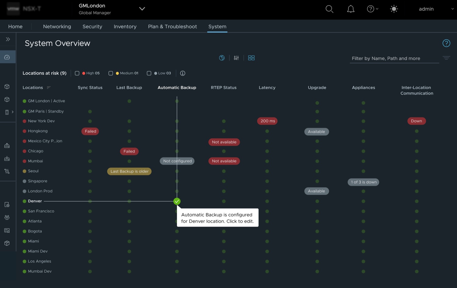
I put every location on a row, every check in a column, and the health of each pair where they meet. The whole estate now reads in one pass, and you fix a problem from the same place you spot it. It beat the concept my own team preferred, in testing with 43 people.
An infrastructure admin running NSX across many data centres has to answer one question constantly: is anything wrong anywhere?
The System Overview answered it one location at a time. Each site got a full-width card with a donut chart and a handful of fields. Two cards filled the screen.
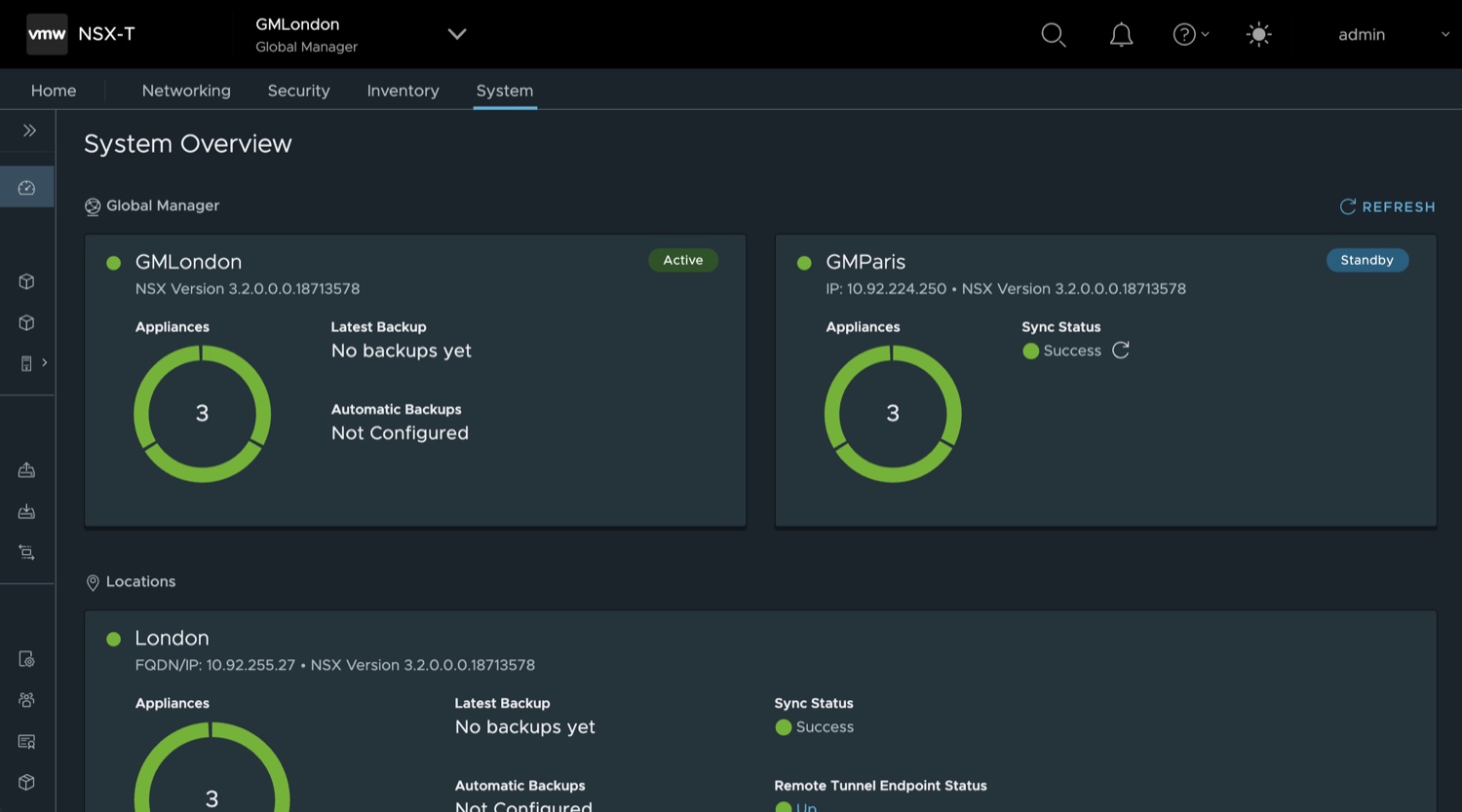
Product management then asked the team to accommodate a much larger set of locations. The obvious move was to keep the pattern and add more cards. I pushed back: at that scale it becomes a scroll nobody reads, and a status you have to scroll to find is a status nobody checks. The layout needed replacing, not extending.
The number we designed against was 32 locations in a single view, across ten parameters each — sync status, backups, RTEP status, latency, upgrades, appliances, inter-location connectivity and more.
Stakeholder interviews first, then problem validation with users against the existing screen. Three personas came out of it, with the Virtual Infrastructure admin as primary — someone whose stated key challenge was that troubleshooting infrastructure issues takes too long.
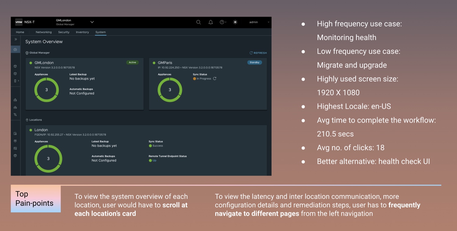
Mapping the journey made the real cost visible to stakeholders: the admin’s goal was never “view a location”, it was quickly assess risk — and every card they had to open was a detour away from it.
That reframed the brief. Not how do we fit more cards, but: how might we visualise the data so risk is visible with minimal navigation, at future scale? With a stated target of improving completion and cutting the mis-click rate by 20%.
Ideation went wide — alluvial diagrams, radial wheels, topology maps, a world map, a grid. We mapped every assumption on Miro before speaking to users, specifically so we would notice our own preferences.
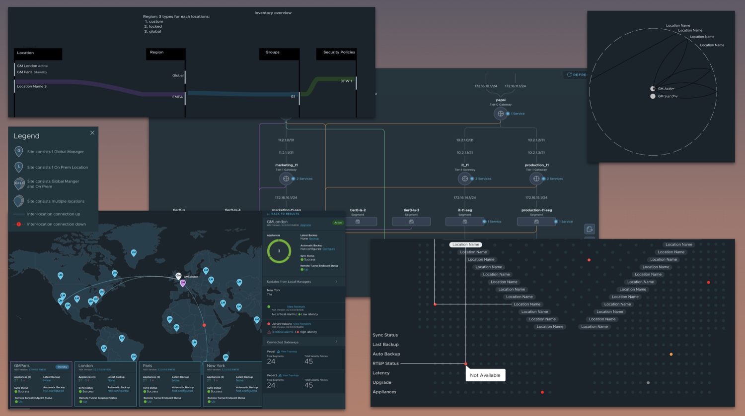
Two survived concept testing. The world map placed each location geographically with connectivity drawn between sites. The fretboard put locations on rows, parameters on columns, and status at every intersection.
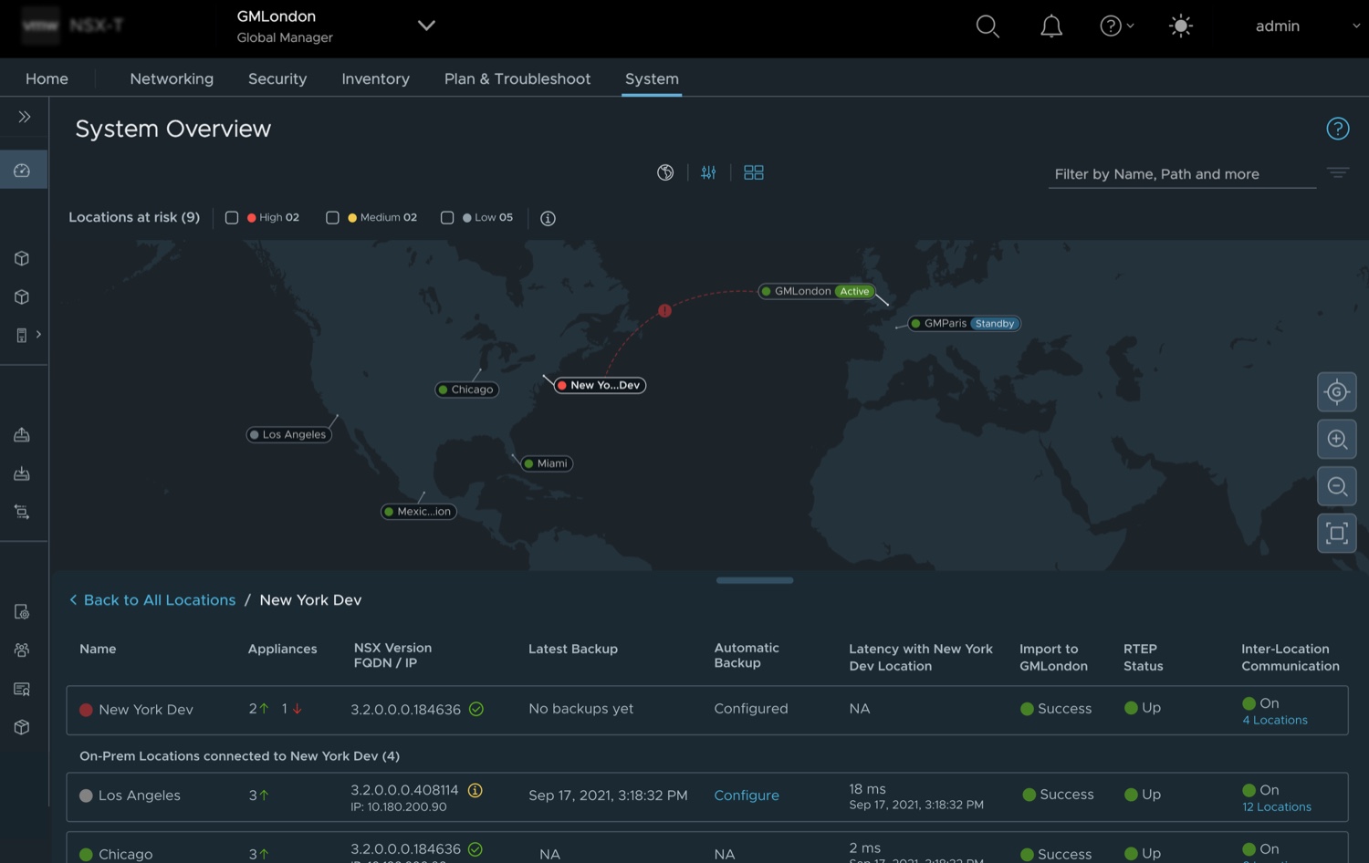
The map was the concept everyone expected to win. That was exactly the problem — it was familiar, not better.
A world map is a good way to show where something is and a poor way to show how much is wrong. Sites cluster in Europe and thin out elsewhere, so the layout is decided by geography rather than by risk, and comparing eight parameters across thirty-two locations still means opening each pin. It does not scale either: add locations and the map gets more crowded, not more useful.
The fretboard inverts that. Every location gets identical space, every parameter is a column you can read down, and adding a location adds a row. We took both into usability testing rather than settling it by argument.
Below is a working recreation you can use — rebuilt from the published patent figures rather than the shipped code, but the behaviour is the same.
Hover or tab to a cell.
Aggregation that does not hide
The letter beside each location rolls its parameters into one risk level, so scanning the left edge alone tells you where to look. It surfaces the highest risk present rather than averaging the parameters — an average lets one critical check hide behind nine healthy ones, and the admin’s question is not how the estate is doing on balance. It is whether anything is wrong. The detail is never buried behind it — it is already on screen, one row across.
The crosshair
At thirty-two rows the hardest part of any grid is knowing which row and column you are actually in. Hovering draws both axes back to their headers, so the correlation is rendered rather than remembered.
The fix, where the problem is
A healthy cell offers Edit. A failed backup offers Configure backup. The action is derived from the status instead of living in a separate menu — which is what removes the round trip, and what the claims in the filing centre on.
Both concepts went into unmoderated usability testing in Maze, with 43 participants.
target was 20%
target was 20%
Usability score 97, average time to complete the workflow 1.5 minutes, average seven clicks. Both targets in the brief were beaten — completion by half again as much as asked.
“Fretboard view is great to spot the differences.”
System Admin, RedLogic.nl — prototype usability testingThe design went to development after refinement; I worked with engineering and quality engineering through implementation.
What I took from it
The 32-location problem looked intractable until problem validation reframed it. The constraint was never screen space — it was that risk assessment had been modelled as navigation.
And the assumption-mapping earned its keep: the world map was a team bias, not a finding. Writing the assumptions down before talking to users is what let the research overrule the room, including me.
VMware filed the work as a US patent application on 11 October 2023, claiming priority to an India filing of 24 July 2023. It published on 30 January 2025 as US 2025/0036264 A1, “Network status visualization for monitoring and configuration.” I am the first-named inventor, with Pavan Vaidyula, Shrinivas Sharad Parashar and Priyanka Bali.
It is a published application, not a granted patent.