Eight visual directions

The same operation, the same 200 hosts, the same numbers. Only the treatment changes, so the comparison is about visual language rather than content.

Specimen is the signature moment: a relative numeric operation that clamps. Log retention → Decrease by → 7d across 200 selected hosts. Every number is real output from model.js.

Operand Speed The tally does not move — 172 · 28 in both states. Only the groups beneath it change.

Swipe the strip sideways to compare · full detail for each is below.

Direction 01Instrument
Operation
Log retentionDecrease by7d
Currently
90d 53 7d 44 14d 38 30d 37 1d 28
172 will change · 28 already match
Transition groups
Decrease by 7d128 will change
clamped at 1d44 will change
already 1d28 hosts
Direction 02Restraint
Operation
Log retentionDecrease by7d
Currently
90d 53 7d 44 14d 38 30d 37 1d 28
172 will change · 28 already match
Transition groups
Decrease by 7d128 will change
clamped at 1d44 will change
already 1d28 hosts
Direction 03Depth
Operation
Log retentionDecrease by7d
90d 53 7d 44 14d 38 30d 37 1d 28
172 will change · 28 already match
Transition groups
Decrease by 7d128 will change
clamped at 1d44 will change
already 1d28 hosts
Direction 01

Instrument

A precision tool, not a screen. Colour only ever encodes state — never mood.

Operation
Log retentionDecrease by7d
Currently
90d 53 7d 44 14d 38 30d 37 1d 28
172 will change · 28 already match
Transition groups
Decrease by 7d128 will change
clamped at 1d44 will change
already 1d28 hosts
Ground
Pure white, no tint.A tinted ground is a colour decision that pays for nothing. White means any tint that does appear is carrying information.
Palette
Neutral chrome, one signal blue.The content already spends five colours on the distribution. If the chrome spends colour too, the operator cannot tell which colours mean something.
Colour semantics
Blue = will change. Grey = will not. Nothing else is coloured.A two-value colour vocabulary can be learned in one glance and never mis-read. Every additional hue is another thing to remember.
Type
IBM Plex Sans, with Plex Mono on numerals.They are metric siblings, so a mixed line like “128 will change” keeps one rhythm instead of two.
Numerals
Tabular, monospaced, everywhere.128 and 44 occupy the same column width, so a stack of counts is comparable without being read. Scanning has to be pre-attentive.
Type scale
9.5 / 11 / 13 / 13.5px. Four steps, no more.Four steps over a 4px grid keeps every size on the rhythm. A fifth step would need a reason and there isn't one.
Hierarchy
Carried by rule weight and letterspacing, not size.Sizes stay close so the eye is not dragged around; a 1px rule against a 2px rule is enough to say “new section”.
Spacing
4px base unit. Dense.This is a review surface. More rows in a screen means fewer scroll events, and scrolling is where review turns into skimming.
Separation
Hairlines only, #dcdfe3.Space costs vertical room and fill costs colour. A rule costs one pixel and separates absolutely.
Radii
0. Everything is square.A radius is a softening gesture. Nothing here wants to be softer than it is.
Elevation
None.Elevation asserts a z-order. Nothing floats above anything else — it is one plane of data.
Motion · timing
150ms, linear.Under ~100ms reads as instant and breaks object continuity; over ~200ms reads as animation. Linear because the digit is the subject, not the curve.
Motion · what moves
The digits count. Nothing else.The distribution did not change, so it must not move. Animating unchanged things asserts a change that did not happen.
Reduced motion
Value swaps instantly. No fallback needed.The design never depended on the transition, so removing it removes nothing.
State encoding
Position and colour. Changing rows sit above unchanged ones, greyed.Order encodes importance for free, before any colour is read.
Contrast
Ink #14161a on white = 16.1:1. Signal blue #1b4ed8 = 8.6:1.Both clear AAA. A language built on hairlines and small type has no contrast budget to spend.
Dark mode
Survives inversion cleanly.Nothing depends on a light ground — hairlines and one signal hue invert without redesign.
At 12 groups
Holds. Rows are 34px, so twelve fit in one screen.Density was chosen for this case, not the demo case.
Costs you
Reads cold unless the typography carries the warmth. And as drawn it does not distinguish clamped from a clean decrease — its palette breaks its own “colour only encodes” rule by treating an ordinal scale as categorical.
Direction 02

Restraint

The current consensus for good enterprise software. Correct to every reviewer on earth.

Operation
Log retentionDecrease by7d
Currently
90d 53 7d 44 14d 38 30d 37 1d 28
172 will change · 28 already match
Transition groups
Decrease by 7d128 will change
clamped at 1d44 will change
already 1d28 hosts
Ground
White, with #fafafc group cards.A near-white card separates without a border, which keeps the surface calm at the cost of a very small contrast step.
Palette
Greyscale plus one indigo at five tints.⭐ Retention is ordinal — 1 < 7 < 14 < 30 < 90. A single-hue ramp encodes that order; five unrelated hues would render an ordered scale as unordered categories.
Colour semantics
Indigo = the accent. Tints = magnitude. Grey = inactive.One hue doing three jobs by intensity. Cheap to learn, but it cannot express a categorical difference — see the cost.
Type
Inter throughout.True tabular figures, wide weight range, and the least surprising choice available — which is the thesis, not a compromise.
Numerals
Tabular, proportional face.Keeps digit alignment without committing to a monospaced voice, which would pull toward Direction 01.
Type scale
11 / 12 / 13.5 / 14px on a 1.15 ratio.A tight ratio at small sizes; anything wider starts to feel like a marketing page rather than a tool.
Hierarchy
Weight and colour. 450 body, 500–600 for emphasis.Inter's weight range is fine-grained enough that hierarchy never needs a size jump.
Spacing
8px base. Generous.Space is doing the separating, so it has to be large enough to read as deliberate rather than as a gap.
Separation
Fill and space. No rules anywhere.Rules would compete with the card fills; using both is how enterprise UI gets noisy.
Radii
8–10px.Large enough to read as intentional, small enough that a data table does not soften into a consumer app.
Elevation
Exactly one level, 0 1px 2px at 4% black.Multiple levels imply layers the data does not have. One says only “this is a surface, the page is behind it”.
Motion · timing
200ms, cubic-bezier(.22,1,.36,1).Long enough to perceive, short enough not to gate the next action. The ease-out settles rather than arrives.
Motion · what moves
Count cross-fades with a 3px rise; card stays put.Moving the card would imply the group itself changed. Only its number did.
Reduced motion
Cross-fade drops to an instant swap.The rise is decoration; the value change is the message.
State encoding
Pill colour and text weight. Unchanged rows go grey-on-grey.Consistent with the accent system, but it renders clamped identically to a clean change.
Contrast
Indigo #5b53e0 on #efeefc = 5.9:1. The two palest bar tints fall under 3:1.⚠ The bottom of the ramp fails non-text contrast. It needs a border or a pattern to stay legible.
Dark mode
Needs a rebuilt ramp.Five tints of one hue on white do not simply invert — the ordering reads backwards on a dark ground.
At 12 groups
Degrades. 62px cards mean twelve rows is two screens.The generosity that makes three groups pleasant makes twelve a scroll.
Costs you
Memorable to nobody. This is the 2026 default, and consensus aesthetics always date — they just date together, which is why the risk feels smaller than it is. The palest bar tints also fail non-text contrast.
Direction 03

Depth

Elevation does real work. The state model made physical.

Operation
Log retentionDecrease by7d
90d 53 7d 44 14d 38 30d 37 1d 28
172 will change · 28 already match
Transition groups
Decrease by 7d128 will change
clamped at 1d44 will change
already 1d28 hosts
Ground
#f1f3f7, a cool light grey.Cards need something to sit on. A white ground with white cards would need borders, which contradicts the whole approach.
Palette
One blue at five steps, plus amber for clamped.Same ordinal ramp as 02. The amber is the argument: the only hue off the ramp, so it reads as categorically different — which is true.
Colour semantics
Blue = proceeding. Amber = the system intervened. Dashed grey = will not move.⭐ Three visual categories for three real outcome classes. The vocabulary matches the model exactly.
Type
Manrope, weight carrying hierarchy.Once elevation separates, rules are redundant. Manrope holds its heavier weights at small sizes better than Inter.
Numerals
Tabular, weight 800 on counts.Heavy numerals survive being placed on a coloured badge, where a lighter weight would smear.
Type scale
10.5 / 11.5 / 13.5 / 14px.Compressed, because elevation is doing the separating that size normally would.
Hierarchy
Elevation first, then weight. Size barely varies.If depth is the system, it should carry the hierarchy — otherwise it is decoration sitting on top of a different system.
Spacing
8px base, 13–16px card padding.Padding is part of the elevation illusion; too tight and the cards read as buttons.
Separation
Elevation, tint and border together.Redundant encoding on purpose — it is the one place all three channels agree, so the classes are unmistakable.
Radii
11–13px.Larger radii read as physical objects. Consistent with the thesis and unusable without it.
Elevation
⭐ Exactly three levels: raised, tinted, recessed.Because there are exactly three outcome classes. Elevation becomes a 1:1 encoding rather than decoration, and the recessed dashed card is a spatial metaphor for this one is not going to move.
Motion · timing
240ms with overshoot.Overshoot implies mass, and mass implies the object is real and persists. That is the thesis: the state model made physical.
Motion · what moves
Count badge scales 0.86 → 1.06 → 1. Card elevation holds.The number is the thing that changed. Lifting the card too would say the group moved, which it did not.
Reduced motion
Overshoot removed entirely, not shortened.A spring at 0ms is a jolt. The correct fallback is no spring at all.
State encoding
Elevation + hue + border style, all three agreeing.The most redundant of the three, and therefore the most robust to colour-blindness and to bad screens.
Contrast
White on #0f62d6 = 5.4:1. White on #b8860b = 3.1:1.⚠ The amber badge fails AA for small text. It needs a darker amber or dark text on the badge.
Dark mode
Hardest of the three.Shadow-based elevation does not exist on dark grounds — it has to be rebuilt as surface-lightness steps.
At 12 groups
Worst of the three. 66px cards plus gaps.Elevation needs space to read, and space is what twelve groups do not have.
Costs you
Ages fastest of the three — compare 2013 skeuomorphism, 2018 flat, 2024 glass. Degrades worst at scale, and the amber badge currently fails AA.

Two things worth arguing about before scoring

1 · Categorical vs ordinal colour. Direction 01 gives the five retention values five unrelated hues. Retention is an ordered quantity, so that encodes an ordinal scale as if it were categorical — a small lie the eye believes. 02 and 03 use one hue at five steps and do not have that problem. This cuts against 01, which is otherwise the strongest on honesty.

2 · Does the language distinguish “the system intervened”? Only 03 marks clamped as categorically different. 01 and 02 render it identically to a clean decrease. The model already separates moved / clamped / already-there — the visual layer can honour that or flatten it, and flattening it is a choice, not a default.

Directions 04–08

The five I did not draw

I gave a Figma agent the same state model, the same 200 hosts and the same specimen — a relative numeric operation that clamps — and asked for five distinct visual directions with a stated reason per property and a stated cost. These are the frames as they came back. Mine above are live HTML; these are static, because that is what they were when everything was scored.

Direction 04

Terminal

The operator's native ground — dark, dense, and honest about being a machine talking to machines.
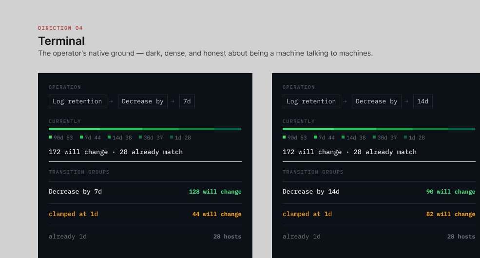
Terminal — the same operation shown twice, decrease by 7d and by 14d.
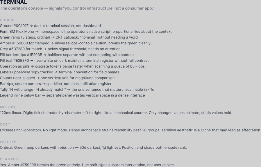
Terminal — every property choice with the reason given for it, plus its stated cost.
Direction 05

Ledger

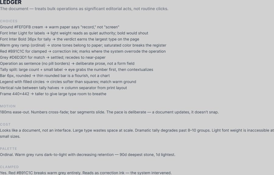
Typography is the interface — weight, size and whitespace carry every distinction that colour and containers carry elsewhere.
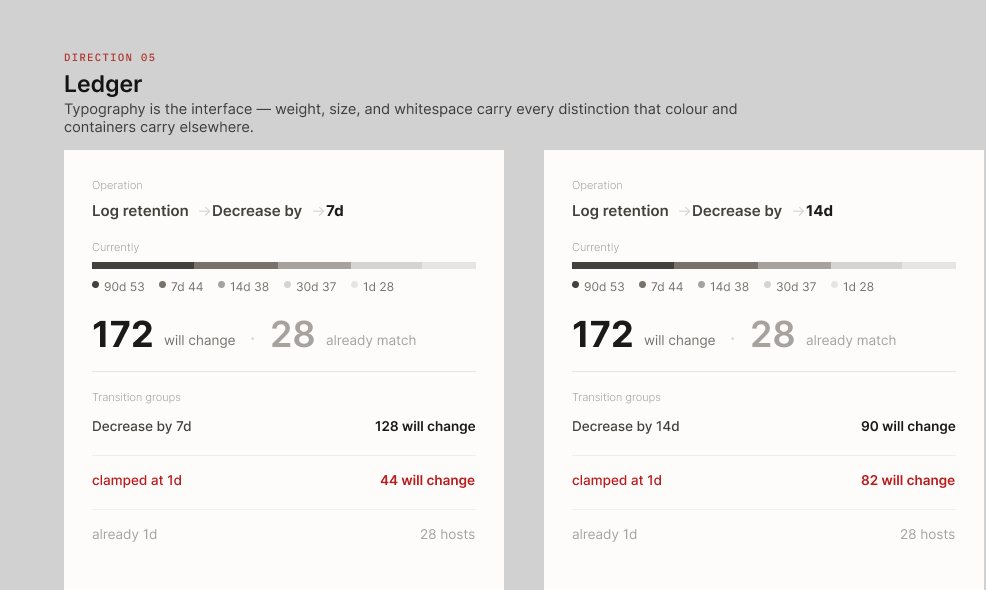
Ledger — the same operation shown twice, decrease by 7d and by 14d.
Ledger — every property choice with the reason given for it, plus its stated cost.
Direction 06

Grid

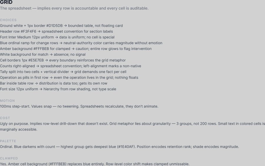
A spreadsheet is the densest truthful display of structured data ever invented — use that instead of reinventing it.
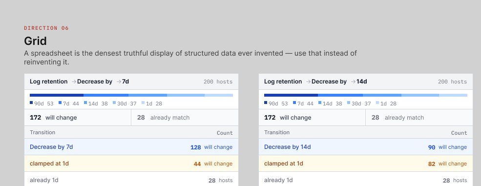
Grid — the same operation shown twice, decrease by 7d and by 14d.
Grid — every property choice with the reason given for it, plus its stated cost.
Direction 07

Flow

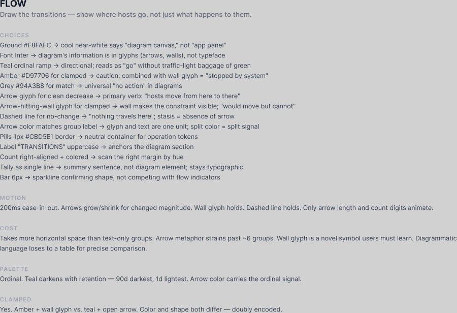
Draw the transitions — show where hosts go, not just what happens to them.
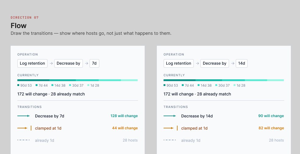
Flow — the same operation shown twice, decrease by 7d and by 14d.
Flow — every property choice with the reason given for it, plus its stated cost.
Direction 08

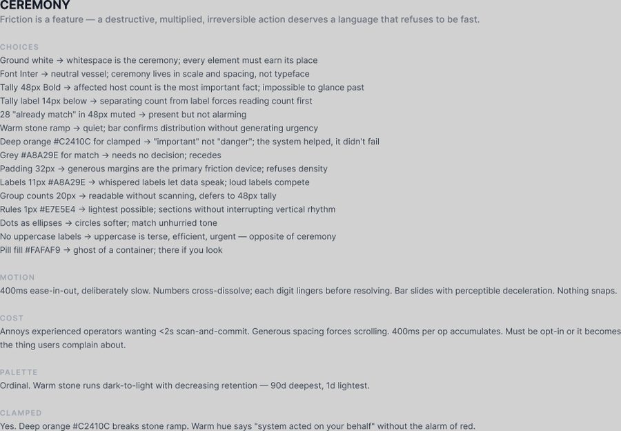
Ceremony

Friction is a feature — a destructive, multiplied, irreversible action deserves a language that refuses to be fast.
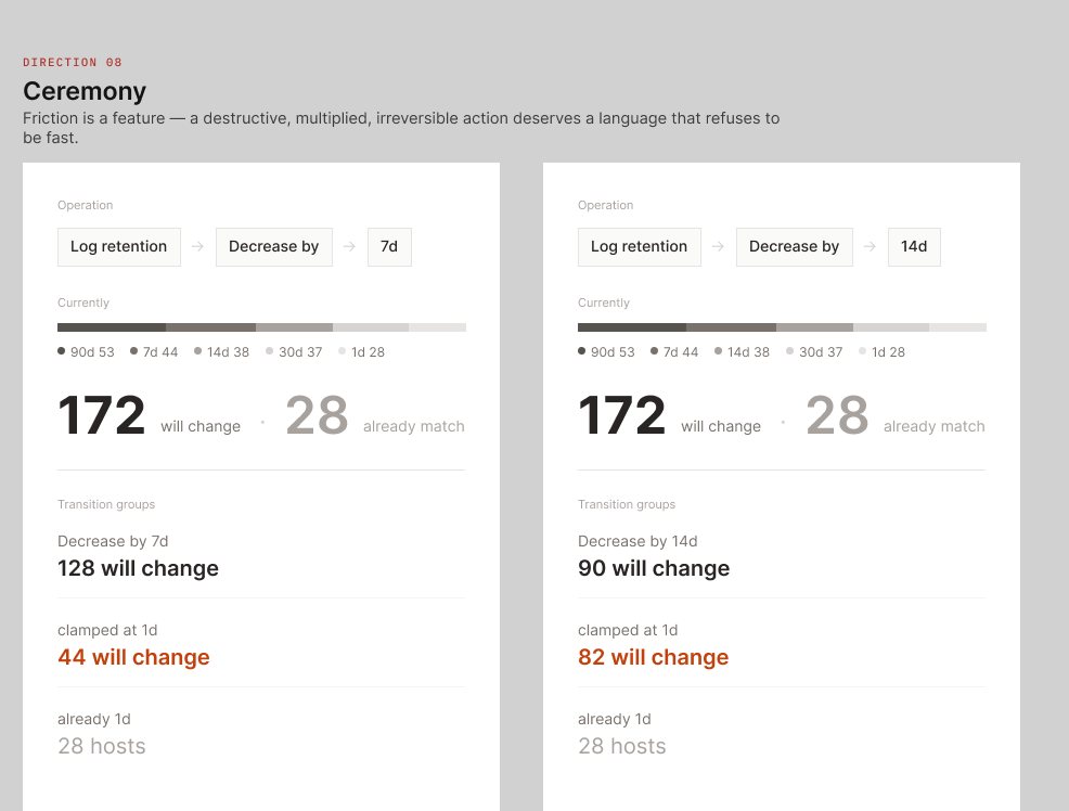
Ceremony — the same operation shown twice, decrease by 7d and by 14d.
Ceremony — every property choice with the reason given for it, plus its stated cost.
Round 2

How they scored

Seven criteria, weighted through a rubric written before the scoring. Contrast was applied as a hard gate rather than a weighted criterion — and it eliminated all eight, which turned it into a better question: is the failure in the palette, or in the mechanism? Only Grid’s was in the mechanism. Mine placed fourth, seventh and eighth.

Direction Weighted Whose
Flow74.7%agent
Ceremony61.3%agent
Grid60.0%agent
Depth57.3%mine
Terminal56.0%agent
Ledger56.0%agent
Restraint46.7%mine
Instrument40.0%mine

Full rubric, weights and per-criterion scores: visual-scoring.md → · back to the case study →